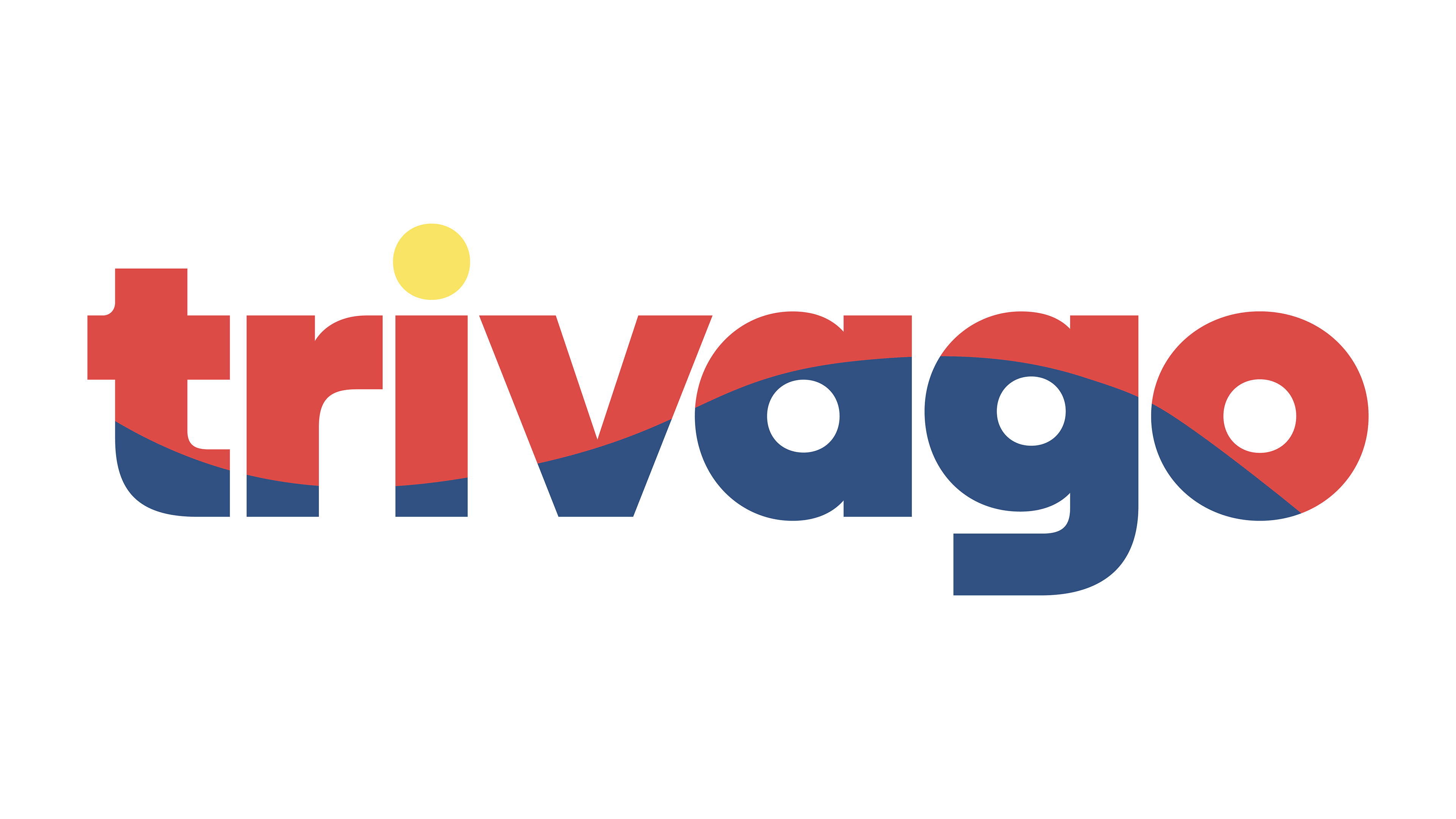
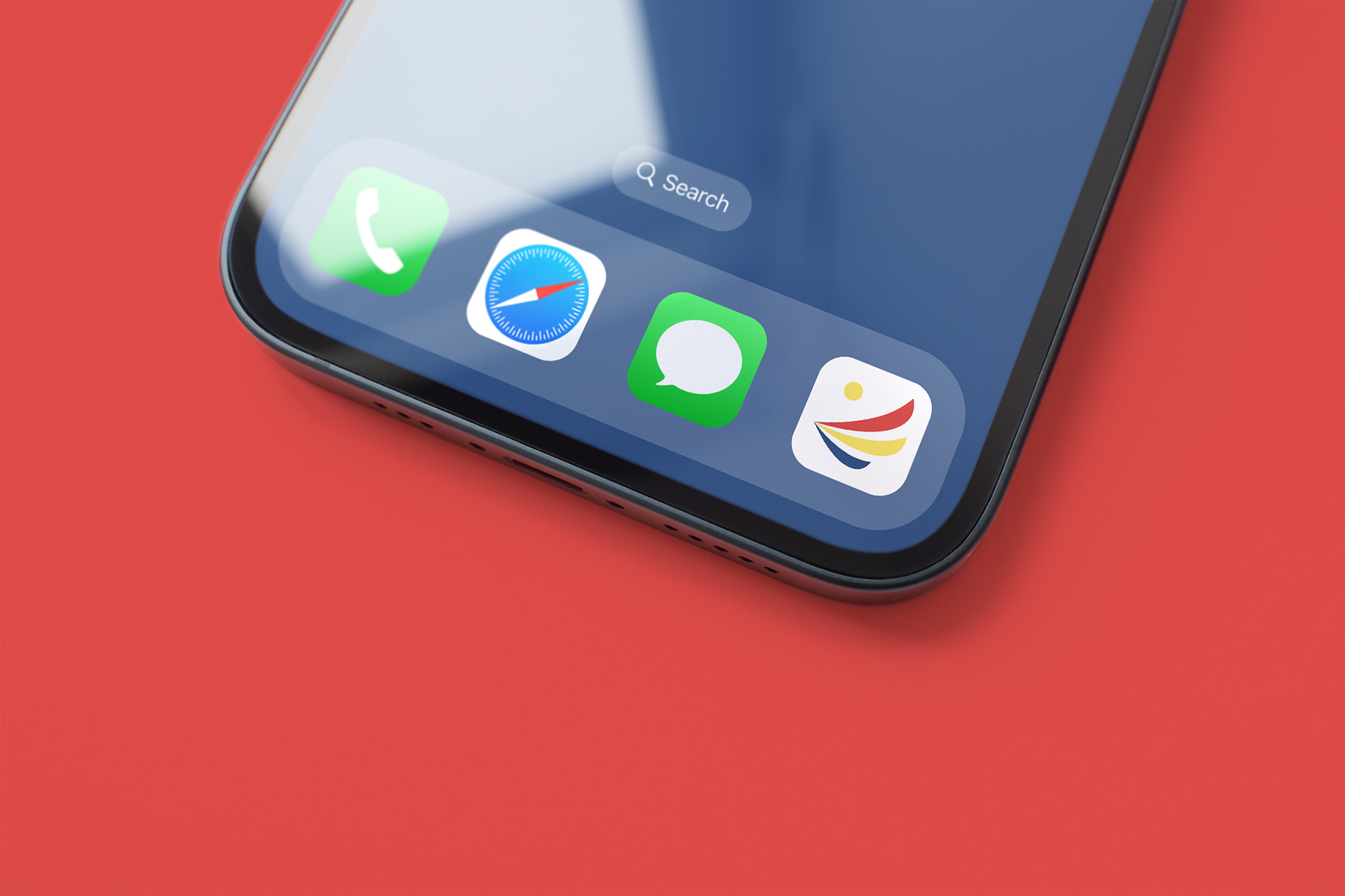
I really enjoyed working on this live brief set by Design Studio to create a new visual identity for Trivago. In this brief we were asked to rebrand Trivago based on the idea of ‘Search Savvy, Feel Super’. Research was a heavy inspiration for my design process, I noticed there was a gap in the market when it came to Trivago’s audience. Young adults (18-25) seemed to be using other travel apps rather than Trivago. This became the target audience I wanted to direct the rebrand to.
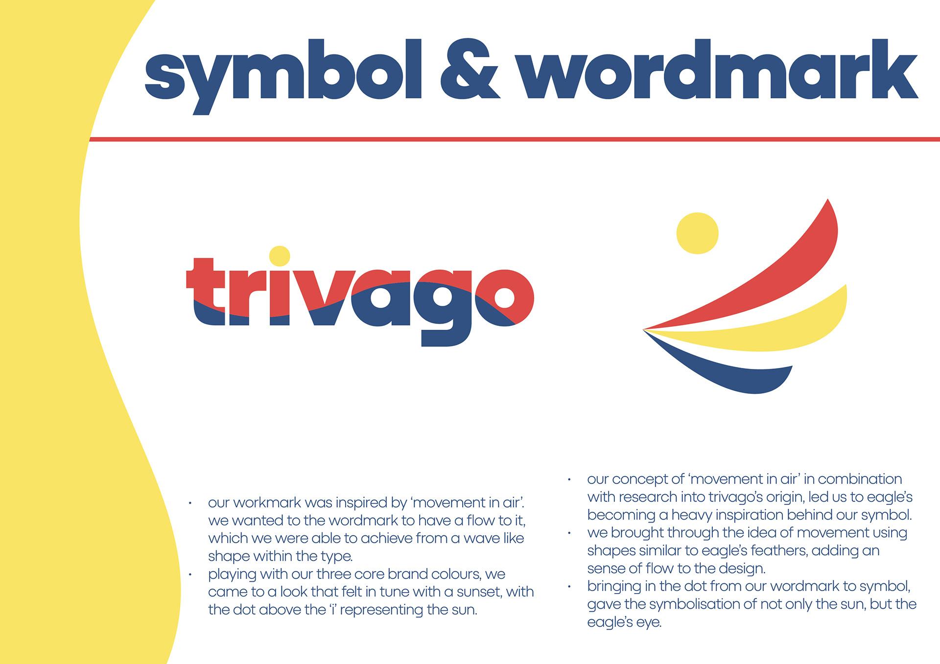
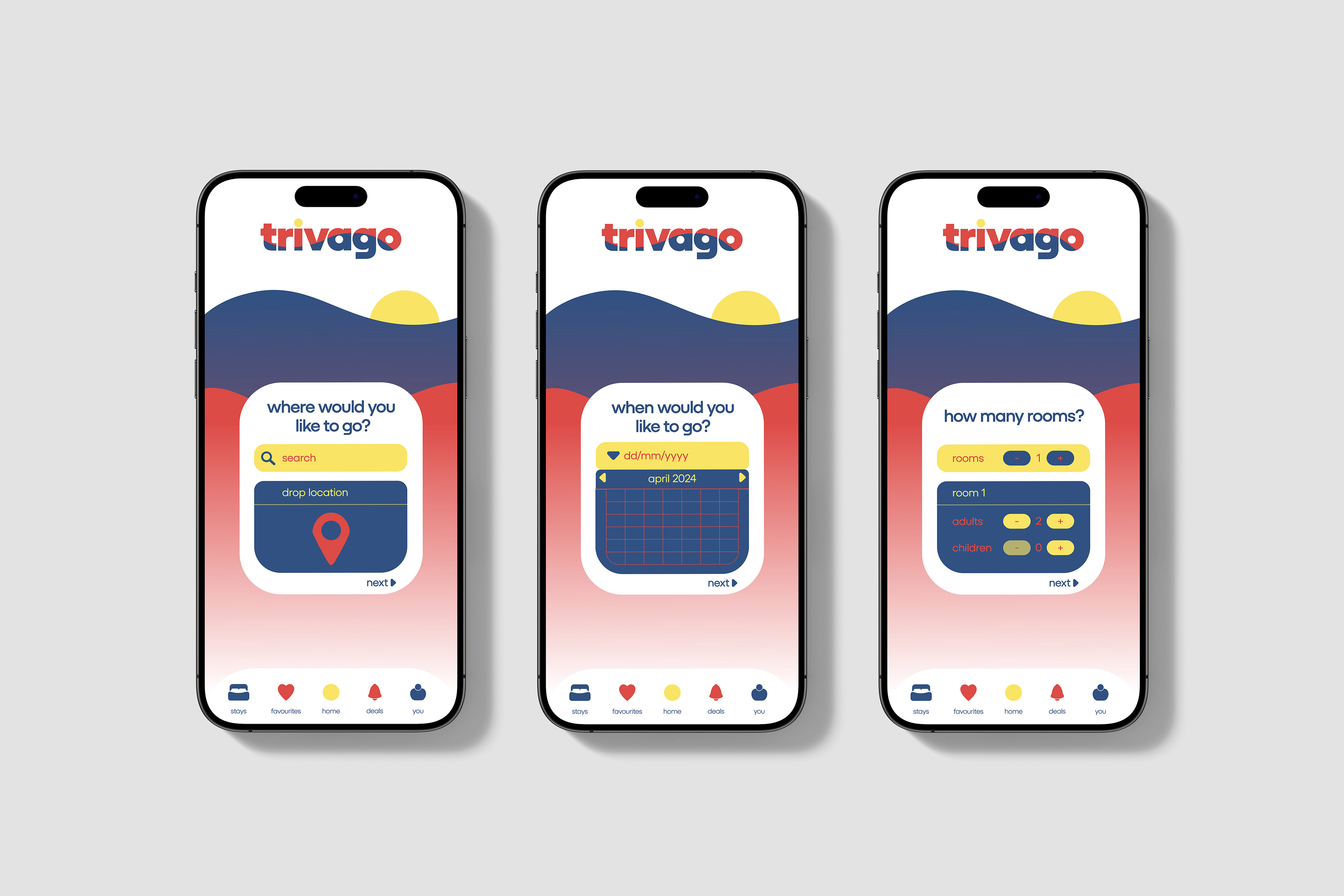
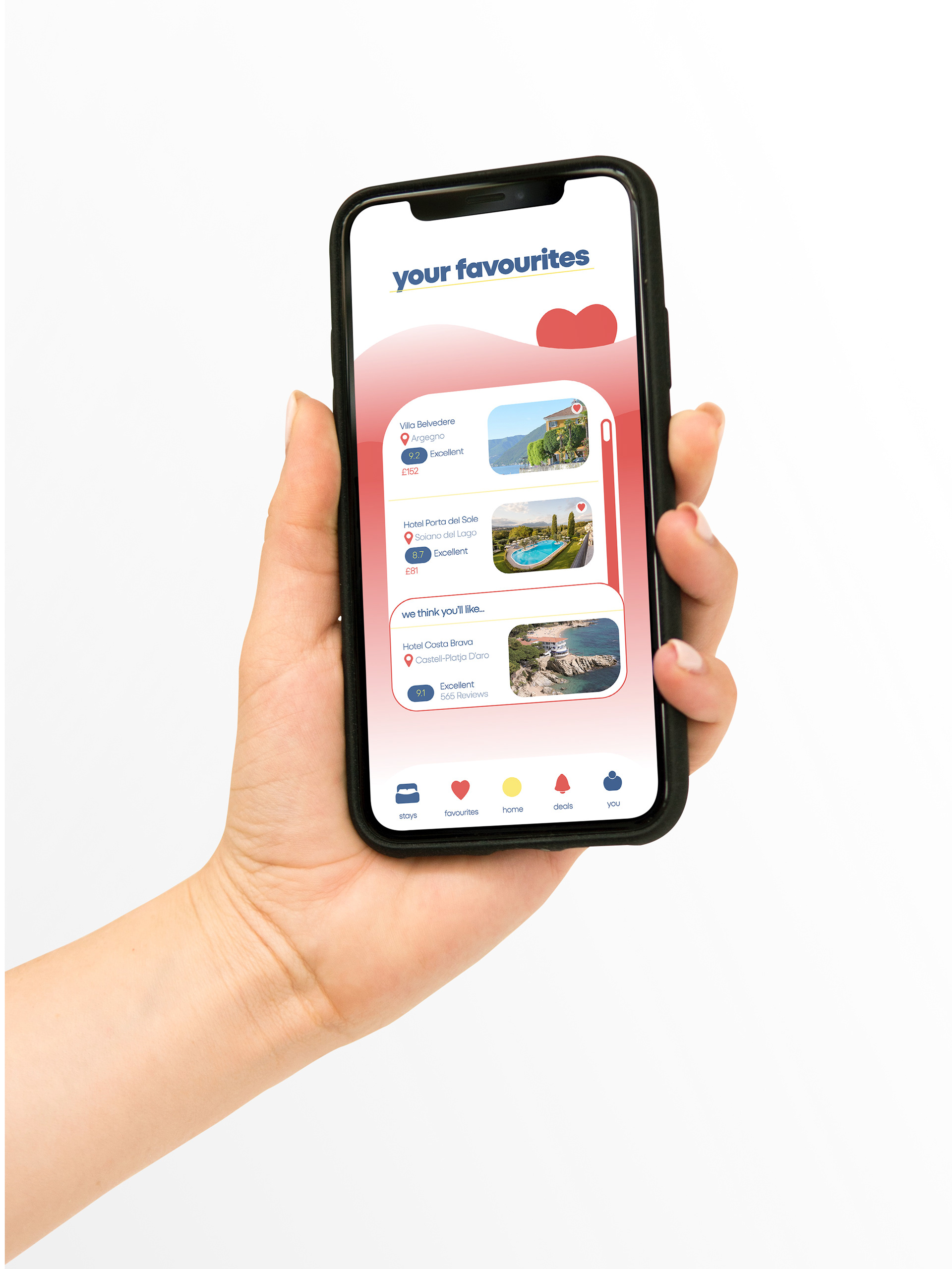
Research into Trivago’s origin led me to Germany’s national symbol: Eagles, this later played a part in creating my concept ‘movement in air’ which I carried through in my design process. The core idea of ‘movement in air’ is the flow of how things move in time and around us. This became visually represented through the feathers of an Eagle, flow of wind, and the daily cycle in time/weather.
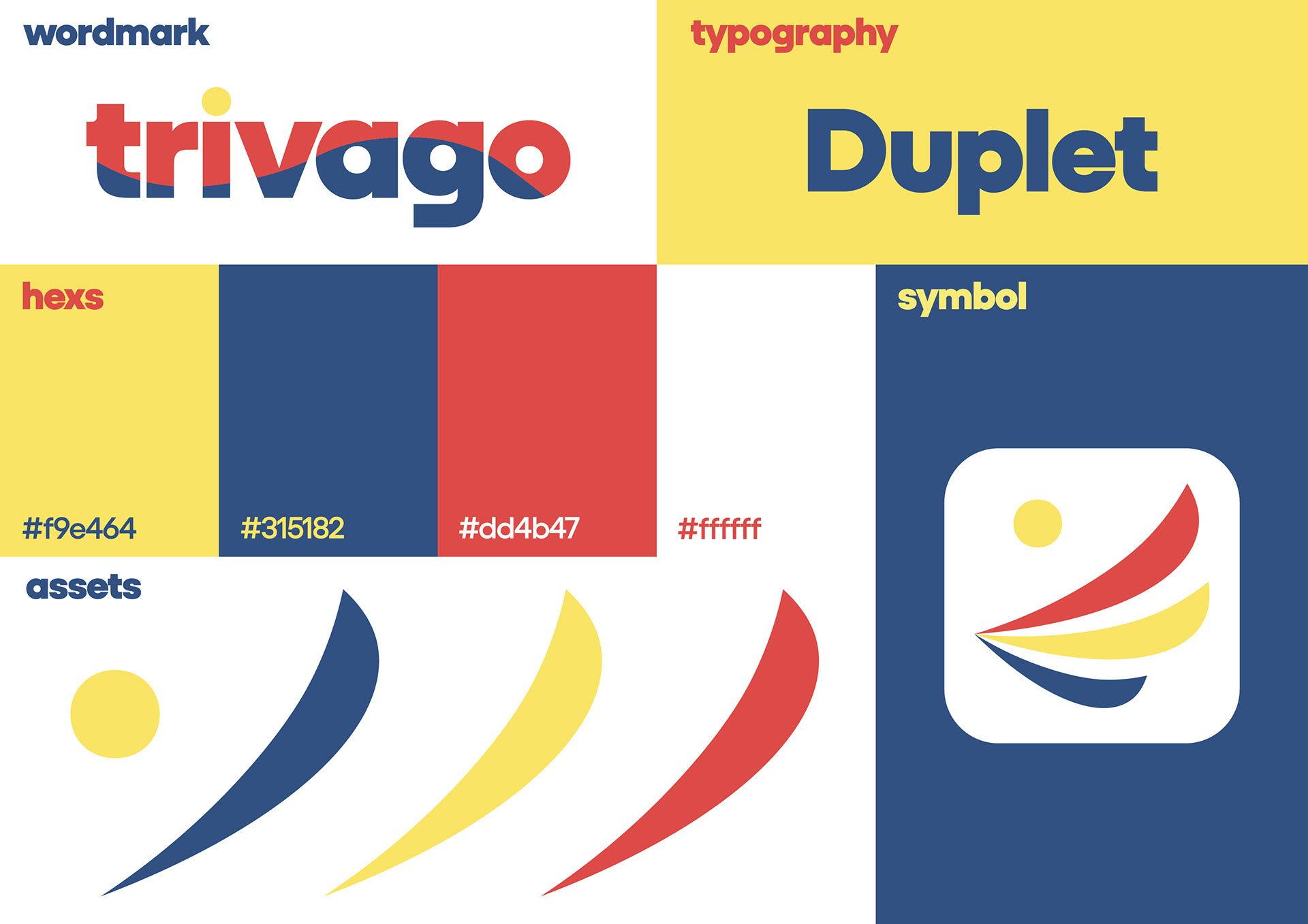
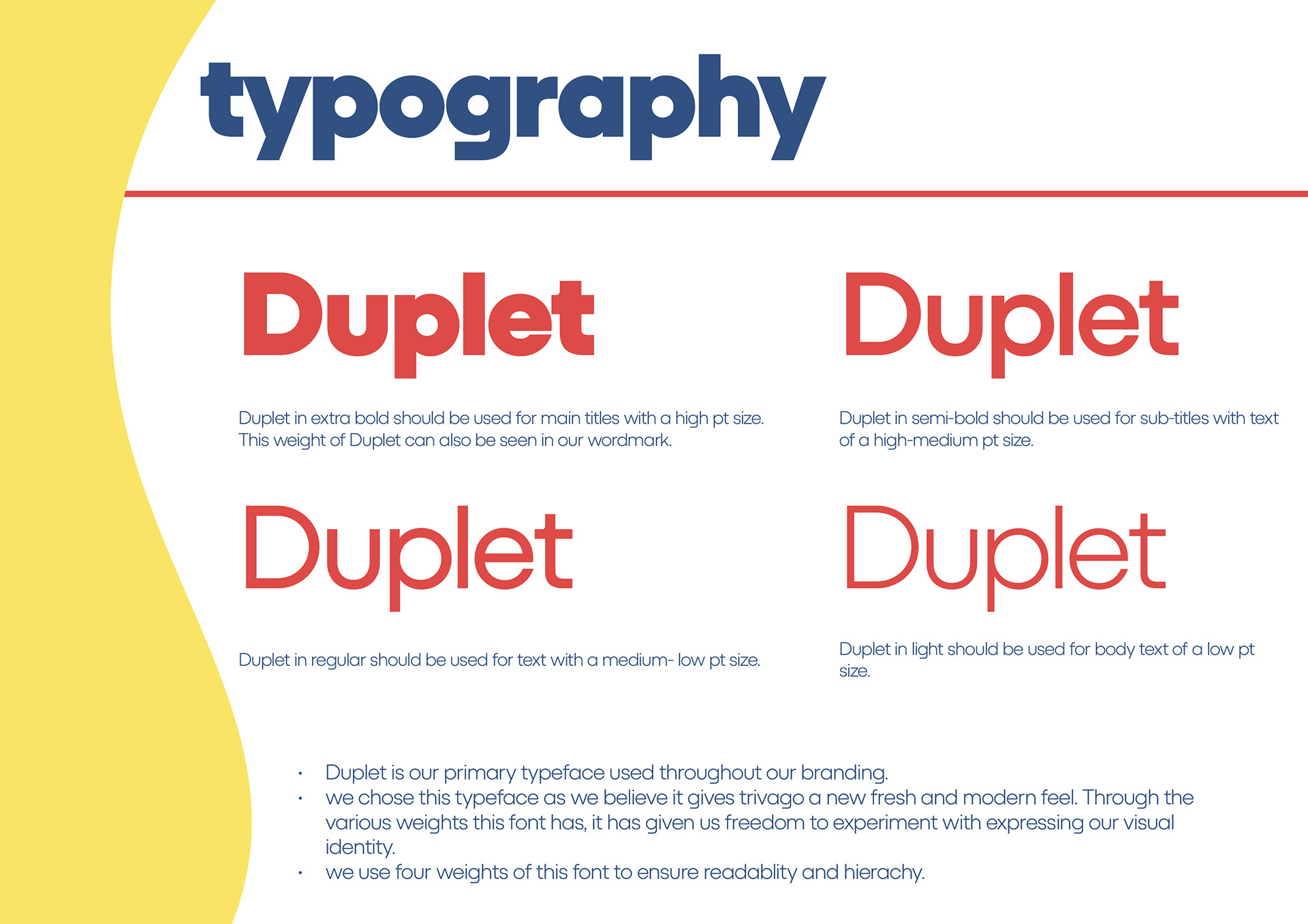
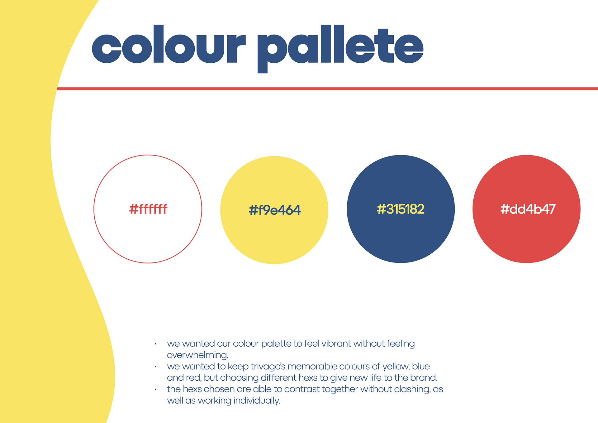
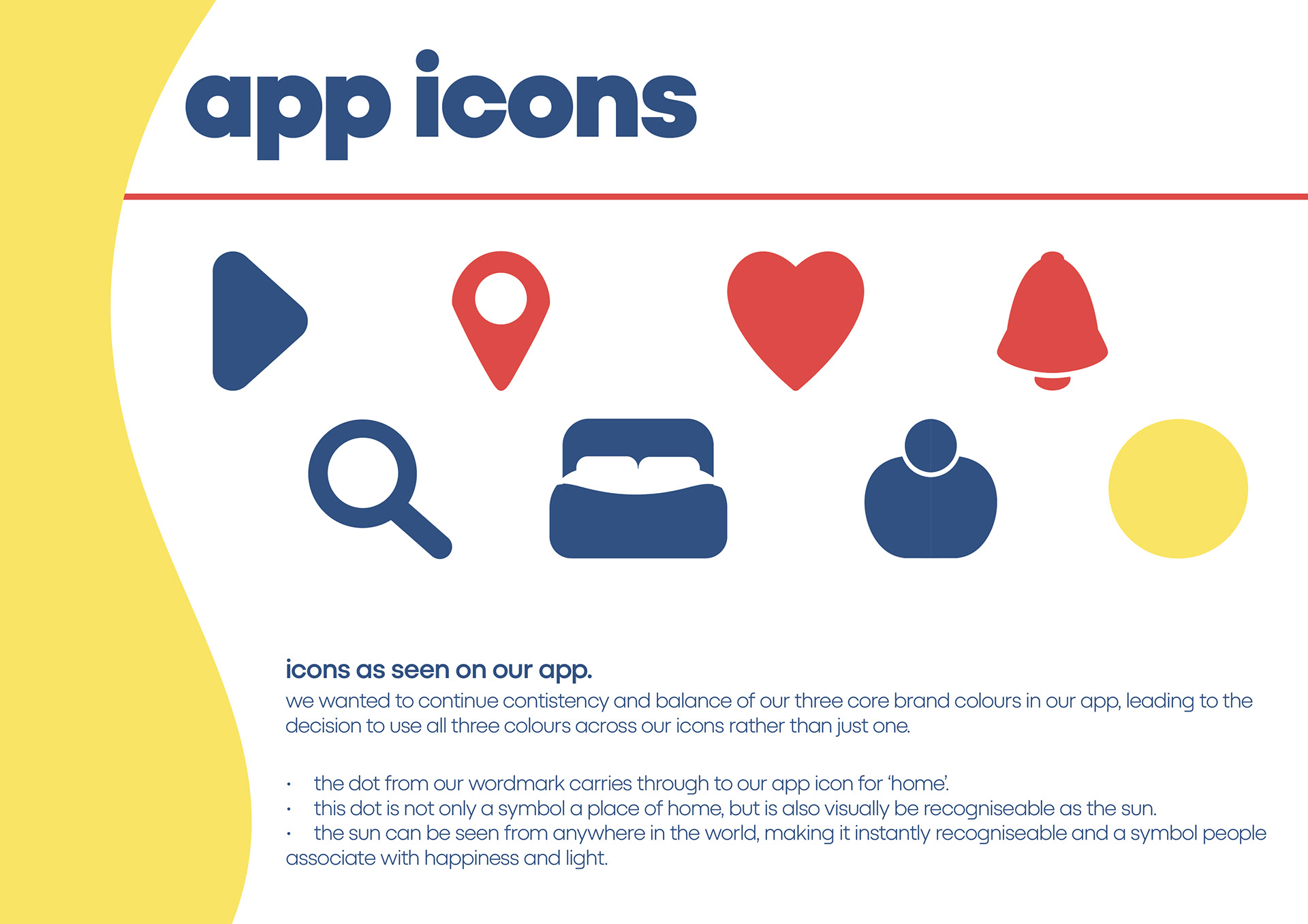

My word mark took inspiration from the idea of ‘flow’, which came to be a sunrise, tying in with Trivago’s brand colours. My symbol became focused on the idea of the Eagle and its feathers. Both the symbol and word mark use a yellow dot that symbolises the sun. The sun to me was important, as it can be seen from anywhere in the world, making it instantly recognisable and something the audience can connect to.
I felt like Trivago’s current tag line of “Hotel, Trivago?” wasn’t working for the brand, as to me it felt like it was missing forming a connection between the brand and it’s audience. This led me to come up with a new tag line “be anywhere you want to be” this was inspired by the idea of travel, and how I want the audience to feel as though it’s easy to travel with Trivago and they can travel to anywhere they want in the world.


Creating app and ad designs for the brand, I thought further about how I could push through my concept of ‘movement in air’. Designing the app I came up with various versions of the home screen, where depending on what time in the day the user would open the app, the screen would change to one that visually represented that time of day.

My billboard design was inspired by research I did on the top three places people go on holiday to from the UK. I thought about what tourist attractions in these countries are most recognisable and used these in the ad, as well as bringing in graphical elements from my word mark and symbol to relate back to my concept.
Finally, I created a logo animation for the brand, my idea here was to push the idea of flow in the word mark, by doing so leaning into the idea of this flow symbolisation of the sun rising. Yet again ensuring the visual identity is carried through and constantly referring back to the brief, my concept and target audience.
BRAND GUIDELINES


